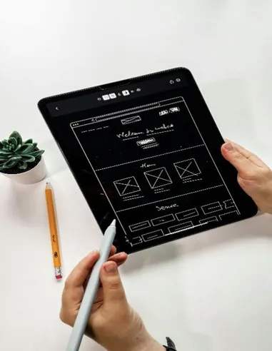
In today’s fast-moving global tech industry, the success of SaaS platforms, mobile apps, and smart devices depends on far more than functional completeness or technical innovation. The user’s first impression of your interface often determines whether they continue using your product. That impression hinges on a handful of seemingly small yet critical localization details.
UI localization is not just about translating text — it’s about reconstructing context and optimizing user experience for each target market. Overlooking linguistic, cultural, or interactional nuances can break trust, even for world-class technologies.
Drawing from Landelion’s global localization expertise, this guide outlines five key dimensions that make or break UI localization success — each directly impacting how users perceive, understand, and trust your product worldwide.

1. Character Length Adaptation: Designing for Multilingual Flexibility
Languages vary dramatically in length and layout. For example, “Submit” becomes “Jetzt absenden” in German (15 characters) and “ホームに戻る” in Japanese (8 characters but double-width). Without accounting for these differences, buttons may truncate, dialog boxes overflow, or UI elements misalign — instantly reducing perceived quality.
💡Landelion Tip:
Introduce a “language expansion buffer” early in the design phase. Allow 30–50% extra width for high-expansion languages such as German and Finnish. This design elasticity isn’t just technical foresight — it demonstrates cultural empathy.
A truly multilingual UI design starts with respecting how languages naturally vary.

2. Cultural Sensitivity Review: Localizing Visuals and UX Across Markets
Colors, symbols, and icons can have drastically different meanings worldwide. Red signifies celebration in China but a warning in parts of East Asia. Hand gestures seen as friendly in Western countries may offend users in the Middle East. Gender options limited to “Male/Female” can appear outdated in Northern Europe, where inclusivity is a norm.
💡Landelion Tip:
Establish a cultural sensitivity audit before each UI release. Review icons, colors, text tone, and interaction logic for regional compliance.
A user interface is not merely functional — it’s a reflection of your brand’s cultural awareness and values.
Culturally aligned design builds emotional connection and long-term brand affinity.

3. Data Format Localization: Building Trust Through Accuracy
Incorrect data formats can undermine trust faster than any visual flaw. The date 03/05/2025 reads as May 3 in the U.S. but March 5 in Europe. Temperature (°C vs °F), weight (kg vs lb), or currency (¥ vs $) mismatches can trigger user confusion or billing errors.
💡Landelion Tip:
Implement context-aware data localization that automatically adapts dates, units, and currencies to regional norms.
Such precision communicates more than accuracy — it signals reliability. In global user experience (UX localization), consistent data formatting reinforces professionalism and credibility.

4. Terminology Consistency: Strengthening Your Brand Language
If “Dashboard” sometimes appears as “Control Panel,” or “Plan” alternates between “Package” and “Subscription,” users will sense inconsistency and question quality. Inconsistent terminology disrupts cognitive flow and weakens brand identity.
As Lingoport and other localization authorities emphasize, terminology management isn’t just about translation — it’s about safeguarding your brand language system across all channels.
💡Landelion Tip:
Develop an enterprise-wide multilingual termbase that defines each technical term, its context, and version history.
Apply these standards consistently across your product UI, help center, and marketing content.
Terminological consistency strengthens trust — and trust scales your brand globally.

5. Context-Driven Translation: Making Copy Feel Native to the Interface
A literal yet context-free translation often sounds awkward or unnatural. “Sync now” correctly translates to “立即同步,” but for a fitness tracker, users care more about “Workout data updated.” Similarly, “Your trial ends in 3 days” needs a polite, gratitude-driven tone in Japanese to preserve brand warmth.
Studies and localization best practices (e.g., TransPerfect's globalLink UI localization guide) confirm that context and usability testing are critical for effective UX localization.
💡Landelion Tip:
Adopt a context-driven translation workflow. Provide translators with full UI screenshots, user flows, and persona context.
Assign linguists who combine product understanding with native fluency.
In UI localization, success is not about translating correctly — it’s about placing language where it truly fits.

Conclusion: Real Localization Is About Being Local, Not Just Global
Tech companies often equate success with complete functionality, but in international markets, true competitiveness lies in making users feel “this product was made for me.”
When interface language feels natural, colors resonate culturally, and numbers display accurately, users develop trust and belonging.
UI localization is not about being more “international” — it’s about being authentically local.
By understanding how language, behavior, and culture intersect, your product can transcend borders — being understood, accepted, and relied upon worldwide.
📩 Take Action
Request a Professional UI Localization Audit
Identify the hidden barriers affecting your international user experience.
Our experts provide tailored insights across:
Linguistic and terminology consistency
Cultural and visual adaptability
Interaction and UX logic alignment


